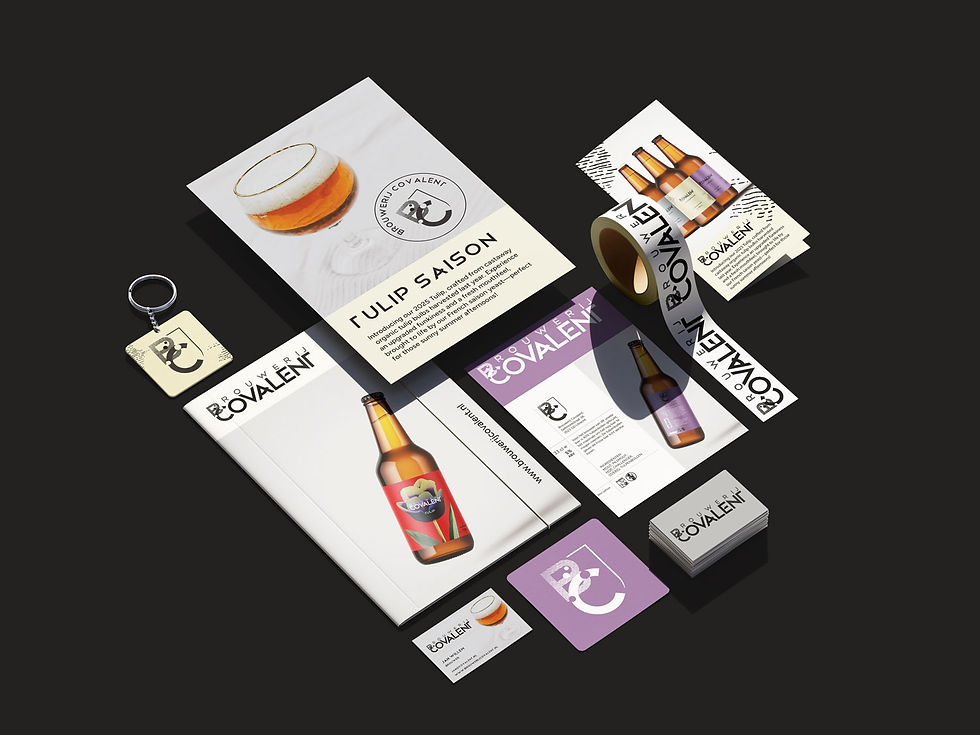
Branding and Packaging for Covalent Brewery
Project:
Branding and Packaging for Covalent Brewery
Services:
Brand Strategy and Brand Identity, and Packaging Design
Client:
Brouwerij Covalent
Brouwerij Covalent is a modern yet traditional craft brewery built on quality, honesty, and strong friendship. Their beers combine classic brewing roots with contemporary styles — all made from natural, local ingredients. They needed a branding system that reflected this philosophy: bold yet timeless, traditional yet modern, and strong enough to support future product lines.
Black Monty Studio developed a complete visual identity: a tailored logo system, a unique custom title font, a strategic typography structure, refined color palette inspired by beer ingredients, and packaging design for their labels.


Approach:
Our goal was to create a brand identity that bridges heritage and modern craftsmanship — just like the beers themselves. The visual direction was built around:
A bold logotype inspired by Telegraphico, individually retouched for elegance
A meaningful BC emblem representing covalent bonding & the founders’ friendship
A custom-made typeface used exclusively for titles
A minimal + modern color palette rooted in natural ingredients (elderflower, tonka bean, grisette)
Clean, structured label layouts designed for consistency across product lines
We approached the design strategically to ensure recognizability, authenticity, and long-term brand scalability.
Progress:
Over several phases, we developed:
1. Logo System
Primary logo with refined letterforms and traditional etching texture
Secondary emblem (BC shield) designed for small-size applications
Favicon + micro-format logo versions
2. Custom Typography
A unique Brouwerij Covalent title font crafted specifically for the brand
A versatile Figtree type structure for body and communication materials
Visual Identity Elements
Minimal black & white core palette
Three product-based secondary colors
Label templates sized for their bottle formats
3. Label Design
Modern grid-based layouts
Illustrative texture references that blend tradition + contemporary aesthetics
Consistent hierarchy and bold character tailored to each beer type


Brand Implementation Across Touchpoints:
The new identity came to life through carefully crafted logo applications, custom typography, and bold packaging — creating a strong and consistent brand experience at every touchpoint.


Result and Impact
The final identity elevates Brouwerij Covalent into a recognizably premium craft brewery.
The brand system:
Communicates professionalism, heritage, and friendship
Gives the brewery a distinct shelf presence via bold, minimal labels
Establishes a scalable visual foundation for future beer lines
Balances tradition with modern brewing culture
Strengthens brand recognition both online and offline
The new identity has become an essential part of Covalent’s storytelling — aligning perfectly with their mission to brew honest, high-quality beers for both enthusiasts and everyday drinkers.

View more work:


